By ATGL
Updated November 24, 2025
A stock market heat map gives traders a fast, visual overview of the market by displaying real-time performance of individual stocks or sectors using color-coded data. These maps quickly reveal market direction, sector rotation, and capital flow, allowing traders to assess market strength or weakness in seconds.
What Stock Market Heat Maps Reveal (and How Traders Use Them Fast)
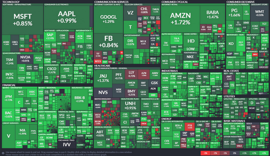
A stock market heat map aggregates the performance of individual stocks into a structured grid, typically organized by sector or index. Color and sizing are used to instantly communicate stock performance relative to peers and the broader market. Typically, shades of green represent gains while red signals losses, with deeper shades indicating stronger movement in either direction.
Traders rely on heat maps for real-time market breadth analysis, gauging the number of advancing versus declining stocks, and identifying outperforming or underperforming sectors. They also help spotlight individual securities with exceptional volume or volatility that could indicate a potential trading opportunity.
Importantly, a heat map is not a trading system in itself. It’s a rapid-scanning tool that enables faster decision-making when paired with indicators, charting tools, and defined strategies. Intraday traders use it to confirm trends and align trades with market momentum. Swing traders analyze sector performance over several days to anticipate and follow sector rotation.
How To Read a Heat Map of Stocks
Understanding how to interpret a heat map of stocks is essential for converting visual information into practical market insights. Although the color‑coded layout appears simple, each element communicates specific data about price movement, sector strength, and market leadership.
Color Intensity and Color Schemes
Each tile in a heat map represents an individual stock or ETF. The color of the tile shows price movement over a specified time interval. Bright green often signals a strong positive return, such as plus three percent or more, while dark red indicates steep losses, such as minus three percent or lower. Neutral or light gray colors suggest little or no movement.
On many platforms, the color-gradient legend shows how colors correspond to percentage gains or losses. Failing to adjust for time frame or market context may cause you to overestimate the significance of a small move during a low-volume session.
Relative Sizing on the Heat Map
Tile size is usually proportional to market capitalization. In an S&P 500 map, for example, mega-cap names like Apple or Microsoft will occupy larger blocks than smaller-cap stocks. This lets you quickly gauge the weight of movement, identifying whether a few large-cap names are pulling a sector up or if strength is broad-based across many constituents.
Sector Grouping and Layout Variations
Most heat maps cluster companies by sector, such as technology, financials, or healthcare, although some are organized by region or index. This grouping structure influences how easily traders can interpret the data. For example, a uniformly green energy sector suggests sector-wide strength, which may not be apparent if the heat map is arranged alphabetically or by ticker symbol.
For forex or commodities, grouping might differ entirely. A forex heat map will present performance by currency pair instead of equity sector.
Using Stock Market Heat Maps for Intraday and Swing Trading
Heat maps support multiple trading styles by helping traders assess volatility and directional bias at key moments.
Intraday traders use heat maps at the open to track where early momentum is building. Green-heavy sectors suggest bullish sentiment, while red clusters may indicate market-wide selling pressure. By midday, heat maps help monitor shifts in leadership or volume, which can inform trade exits or entries. Near the close, traders check for end-of-day reversals or sustained strength.
Swing traders use heat maps to assess which sectors are gaining strength over several days or weeks. For instance, if the consumer discretionary sector turns green after multiple sessions of weakness, it could signal the start of a sector rotation. Identifying strong or weak sectors early helps construct watchlists aligned with market direction.
Monitoring changes in sector performance across sessions is one way to identify capital rotation between growth and defensive areas. If technology weakens while utilities strengthen, it can signal a shift to risk-off sentiment, guiding traders to reduce exposure to higher-beta stocks or reevaluate setups accordingly.
Heat maps offer a valuable visual representation of this rotation, helping you track how capital moves across industries in response to changing market sentiment.
Combining Stock Market Heat Maps With Technical Indicators
While a heat map offers a high-level snapshot, technical indicators refine trade decisions. Most professional traders combine both to filter out false signals and improve entry precision.
- Moving averages confirm whether a stock is trending by showing if it is trading above its 50-day or 200-day average. This helps validate the direction of the move shown on the heat map.
- Momentum indicators like RSI or MACD assess the strength behind a move. Elevated RSI readings, for example, may indicate that a stock appearing strong on a heat map is overbought.
- Volume analysis identifies whether price action is supported by strong participation. A stock showing a large gain but trading on low volume may signal weak conviction. Volume-based tools help filter out false signals.
Suppose the heat map shows a strong gain in semiconductor stocks, with NVIDIA highlighted in deep green. Before entering a trade, you check the stock’s position relative to its 50-day moving average, its RSI hovering near 60, and volume at 150% of average. This combination strengthens the probability of continuation and supports initiating a position.
Heat maps serve as effective visualization tools when paired with structured analysis. Tools such as dynamic stock charts allow traders to track real-time market movement with technical overlays. Having a strong grasp of the components of stock charts also helps you carry out accurate technical analysis and better trade planning.
Mistakes To Avoid When Using Stock Market Heat Maps
Using heat maps in isolation without confirming indicators or chart structure often leads to poor trade decisions. Always validate insights with technical tools and risk management. Ignoring sector weighting is another risk. A sector may appear strong due to a single large-cap stock. Review relative sizing to see whether the strength is broad or isolated.
Overreacting to intraday moves is a common error. Heat maps are dynamic and can change significantly throughout the session. Avoid chasing names based solely on early movement. Time frame alignment is critical. Daily and weekly maps may display different trends. Make sure your heat map aligns with your strategy, whether intraday, swing, or longer term.
Misinterpreting color thresholds also leads to false conclusions. A plus 0.5% percent move might appear bright green on a quiet day but minor during a high-volatility session. Before acting on heat map data, traders should focus on reading stock charts to validate price structure, volume trends, and momentum indicators. Paired with techniques for identifying trends in stock charts, this ensures that decisions are grounded in technical evidence instead of visual cues alone.
Use Heat Map Insights To Strengthen Your Trading Strategy
Integrating heat maps into your trading process offers immediate awareness of market dynamics, sector rotation, and standout opportunities. When combined with technical indicators and structured risk controls, heat maps become a vital component of your analysis toolkit.
Each heat field in the map delivers a compact view of a security’s influence on overall market performance, allowing traders to identify which names are driving price action and which may be lagging. For more precise analysis, heat maps are most effective when paired with reliable charting software that supports multi-indicator overlays and real-time data.
Above the Green Line incorporates heat maps and stock charts in investing into a broader system that combines objective signals, relative strength, and disciplined entries, using technical indicators like moving averages and volume trends to support data-driven decisions. Explore our memberships for access to proprietary scans, expert chart annotations, and trading routines designed to support consistency across all market conditions.

Related Articles
Margin Call Explained: What Triggers It and How to Avoid One

AMC Short Squeeze Explained: Timeline, Causes, and Trading Risks
Volatility Clustering in Financial Markets: Understand Why It Happens
Chaikin Money Flow (CMF): How to Use Volume to Spot Real Market Strength