
Stock charts are powerful tools that allow investors and traders to visualize and analyze stock price movements. To fully understand how to interpret and use these charts, it’s important to break down the key components that make up a stock chart. In this guide, we will dive into the essential elements of stock charts: price axes, time axes, candlesticks, volume bars, and trendlines. Each of these elements plays a crucial role in helping you assess market trends and make informed decisions about stock trades.
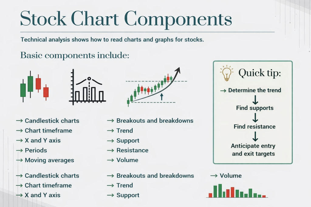
The price axis, also known as the Y-axis, is the vertical line on a stock chart that represents the price levels of a stock. This axis shows the range of prices for the stock over the selected time period. The Y-axis helps you track how the stock price fluctuates during that time period, whether it’s rising, falling, or remaining stable.
Understanding the price axis is essential because it gives you a direct view of how much the stock is worth at any given point in time, helping you assess its value relative to past movements.
The time axis, or X-axis, is the horizontal line at the bottom of the chart. It represents the passage of time and shows how the stock’s price changes during a specific period. Depending on the chart, this period can vary from minutes to years, depending on the level of detail you’re looking for.
By looking at both the price and time axes, you can assess not only how much the stock’s price has moved but also when significant price shifts occurred, helping you evaluate the timing of past trends.
Candlesticks are one of the most commonly used visual representations on stock charts. A single candlestick displays the price movement of a stock over a specific time period, showing four critical price points: the open, close, high, and low.
Each candlestick consists of two parts:
Candlesticks provide detailed information about price action within a specific time frame, helping traders interpret short-term market sentiment and identify key points of price reversal or continuation.
Volume refers to the number of shares traded during a given time period. Volume bars are typically placed beneath the price chart, and they display the amount of trading activity within that period. Volume is an important indicator because it helps assess the strength of a price move.
Volume bars are essential for assessing the strength of a trend. They help traders determine whether a price move is backed by significant market participation or whether it’s just a temporary fluctuation.
Trendlines are drawn lines that connect two or more price points on a stock chart, used to visualize the general direction of a stock’s price. Trendlines help identify the prevailing direction of price movement, whether it’s upward, downward, or sideways.
Trendlines are important because they help traders identify the direction of the market and potential reversal points. By drawing trendlines on your chart, you can spot support and resistance levels, helping you make better decisions about when to buy or sell.
Stock charts are essential for traders and investors who want to analyze price movements and make informed decisions. By understanding the key components of a stock chart—such as the price and time axes, candlesticks, volume bars, and trendlines—you can gain valuable insights into market trends, sentiment, and potential opportunities.
As you continue your journey into stock chart analysis, mastering these key elements will allow you to spot trends, understand price movements, and use technical analysis to your advantage. While these components are just the beginning, they form the foundation for more advanced charting techniques that will be explored in later guides. Happy charting!
Please send some profits to help animals
A snapshot of the daily updates that help traders stay aligned with market direction.

Above The Green Line’s systematic approach has completely transformed my trading. I’ve gone from inconsistent results to reliable gains, even during market downturns.”
The systematic approach has been a game-changer for my portfolio. I no longer second-guess my trading decisions and have seen consistent returns even in volatile markets.”
Sarah K.
Michael R.
Engineer & Part-time Trader
The community aspect is invaluable. Being able to learn from experienced traders and discuss strategies in real-time has accelerated my trading knowledge tremendously.
David L.
Business Owner