By ATGL
Updated September 24, 2025
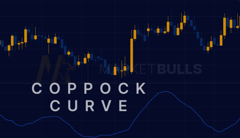
The Coppock Curve is one of the most distinctive long-term momentum indicators in technical analysis, and it’s specifically designed to identify major market bottoms. This unique oscillator operates on monthly timeframes, making it particularly valuable for investors seeking long-term entry points. Unlike conventional momentum indicators focusing on daily price movements, the Coppock Curve indicator analyzes extended market cycles to signal when major downtrends may be reaching exhaustion.
What Is the Coppock Curve?
The Coppock Curve, developed by economist Edwin Coppock in 1962, represents a momentum oscillator combining rate-of-change calculations with weighted moving averages. Coppock originally created this indicator for the Episcopal Church’s investment committee, drawing inspiration from the human grieving process. He theorized that markets required approximately 11 to 14 months to heal from major declines.
This psychological foundation underlies why the Coppock Curve uses 11- and 14-month lookback periods. The indicator operates exclusively on monthly data, making it unsuitable for day trading patterns but valuable for long-term investment opportunities. The Coppock Curve’s primary strength lies in spotting major market bottoms following significant bear market declines.
By incorporating extended timeframes, the Coppock Curve filters out short-term market noise and focuses on substantial directional changes that often mark the beginning of new bull market cycles.
Coppock Curve Calculation
Understanding the Coppock curve calculation requires breaking down its multi-step process combining two rate-of-change periods with weighted moving average smoothing.
The Coppock Curve formula begins with calculating the 11-month and 14-month rate of change:
- 11-month ROC = ((Current Price / Price 11 months ago) – 1) × 100
- 14-month ROC = ((Current Price / Price 14 months ago) – 1) × 100
These values are then combined:
ROC Sum = 11-month ROC + 14-month ROC
Finally, a 10-period weighted moving average is applied:
Coppock Curve = 10-period WMA of ROC Sum
This Coppock curve calculation produces an oscillator fluctuating above and below zero. The weighted moving average smoothing reduces volatility while preserving responsiveness to significant momentum shifts.
How To Interpret Coppock Curve Signals
Interpreting Coppock Curve signals focuses on zero-line crossovers and momentum direction changes. The most significant signals occur when the indicator crosses above zero from negative territory, suggesting downward momentum is exhausting and upward momentum is building.
Zero-line crossovers represent the foundation of Coppock Curve analysis. When the indicator moves from negative to positive readings, it signals a potential major market bottom and favorable conditions for long-term positioning. Movements from positive to negative readings may indicate deteriorating momentum, though the indicator was designed for identifying bottoms rather than tops.
Rising curve momentum occurs when successive monthly readings show increasing values, even below zero. This suggests underlying strength is building and often precedes zero-line crossovers. Falling curve momentum indicates weakening conditions but requires careful interpretation since the indicator can remain negative for extended periods.
Signal strength depends on the depth of negative readings before crossovers and movement slope. Stronger signals typically emerge after extended periods in deeply negative territory, followed by sharp upward momentum carrying the indicator decisively above zero.
Historical Performance and Coppock Curve Chart Examples
Historical analysis reveals the Coppock Curve’s effectiveness in identifying major market bottoms. Notable successes include signals during the 1974-1975 recession, 1980-1982 period, 2000-2002 dot-com crash, and 2008-2009 financial crisis recovery.
During the 1974 market decline, the Coppock Curve reached deeply negative readings before generating a buy signal in late 1974, preceding a substantial multi-year bull market. The 2002 signal occurred near the bear market’s end following the dot-com bubble, positioning investors favorably for recovery.
The 2009 example provides compelling evidence of the indicator’s value. Following the financial crisis, the Coppock Curve generated its signal in early 2009, coinciding with one of the most significant market bottoms in decades.
Coppock curve chart analysis of market indices demonstrates consistent patterns across different environments. Performance appears strongest following prolonged bear markets or significant economic disruptions.
Practical Applications for Traders and Investors
The Coppock Curve’s monthly timeframe makes it unsuitable for short-term trading but excellent for strategic portfolio positioning. Applications include retirement account management, long-term equity allocation, and institutional portfolio timing.
Some analysts experiment with different rate-of-change periods or weighted moving average lengths, though the original 11-14-10 combination has proven durable. Conservative investors might extend the smoothing period to reduce false signals.
Common mistakes include attempting short-term trading use or expecting immediate results. The indicator emphasizes patience and long-term perspective. Traders sometimes misinterpret the lag as weakness rather than recognizing it as confirmation.
As a lagging indicator, it cannot predict market bottoms but confirms them after they occur. Investors may miss early uptrend beginnings but gain confidence in established momentum shifts. The indicator performs better in traditional market cycles and may be less reliable during extended sideways markets.
Confirming Coppock Curve signals through additional analysis strengthens investment decisions. Many professional investors combine the indicator with fundamental analysis, market insights, and other technical tools.
Comparing Coppock to Other Momentum Tools
The Coppock Curve differs significantly from popular momentum indicators like MACD, RSI, and Rate of Change in timeframe and application. While MACD operates on daily or weekly data providing frequent signals, the Coppock Curve’s monthly focus generates infrequent but more significant signals for long-term positioning.
RSI measures overbought and oversold conditions across various timeframes, offering different information than the Coppock Curve’s momentum analysis. The Relative Strength Index excels at identifying short-term extremes, while the Coppock Curve identifies major cyclical turning points. Rate of Change indicators share mathematical similarities but typically operate on shorter timeframes and lack smoothing components reducing false signals.
The Coppock Curve provides advantages during major market transitions, post-recession positioning, and long-term retirement management. Its psychological foundation and extended timeframes make it valuable when traditional technical analysis may be less reliable.
However, the Coppock Curve underperforms during extended sideways markets, providing few meaningful signals. In rapidly changing environments where U.S. market conditions shift quickly, the indicator’s lag may result in missed opportunities.
Combining the Coppock Curve with complementary indicators often produces superior results. Many professionals use it alongside MACD on monthly charts to confirm signals or incorporate fundamental analysis to validate economic conditions underlying signals.
Using the Coppock Curve for Successful Trading
The Coppock Curve represents a specialized tool for long-term market timing and strategic investment positioning. Its unique combination of rate-of-change calculations and weighted moving averages creates an indicator designed to identify major market bottoms following significant declines.
Success requires patience, proper expectations, and integration with broader strategies. The indicator works best as one component of a comprehensive approach rather than standalone system. Professional investors often combine Coppock Curve signals with fundamental analysis, economic indicators, and complementary technical tools.
For investors seeking to enhance their long-term market timing capabilities and access professional-grade analytical tools, Above the Green Line’s membership provides comprehensive resources for implementing sophisticated technical analysis strategies. These tools help investors develop systematic approaches to using momentum indicators like the Coppock Curve within diversified investment frameworks, supporting more informed long-term investment decisions.


