
OHLC Charts: A Detailed Guide to Price Analysis in Investing
Investors and traders utilize various analytical tools to interpret price movements and market trends. One of the most widely used chart types for this purpose is the OHLC chart. Providing a detailed representation of an asset’s price action, the OHLC chart displays four key data points for each time period: open, high, low, and close prices. This comprehensive data enables traders and investors to gain a deeper understanding of market conditions, making OHLC charts a valuable tool for informed decision-making.
In this guide, we will explore what OHLC charts are, how they work, and how they can be used to enhance your investment strategies.
What is an OHLC Chart?
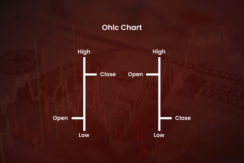
An OHLC chart (Open, High, Low, Close) is a type of financial chart used to represent price data over a specified time period. Unlike simpler chart types such as line charts, which only display the closing price, OHLC charts provide a more comprehensive view by including four important data points:
- Open: The price at which the asset opens at the start of the time period.
- High: The highest price reached during the time period.
- Low: The lowest price during the time period.
- Close: The price at which the asset closes at the end of the time period.
Each bar on an OHLC chart represents one time period, and the four data points are visually displayed within each bar. These bars provide valuable information about how the asset’s price fluctuated throughout the period, which can help traders and investors make more informed decisions.
Structure of an OHLC Chart
An OHLC chart is structured using vertical lines or bars, with each bar representing one time period (such as 1 minute, 1 hour, or 1 day, depending on the chart’s time frame). The structure of the OHLC bar is as follows:
-
Vertical Line (The Bar): The vertical line in the bar represents the range between the high and low prices for that period. The length of this vertical line shows how much the asset’s price fluctuated during the time period.
-
Horizontal Ticks (The Open and Close): There are two horizontal ticks, one at the left and one at the right of the bar:
- The left horizontal tick represents the open price (the price at the beginning of the period).
- The right horizontal tick represents the close price (the price at the end of the period).
-
Bullish or Bearish Bars: If the close price is higher than the open price (indicating that the asset’s price rose during the period), the bar is typically shown in green or hollow. If the close price is lower than the open price (indicating a decline in the asset’s price), the bar is shown in red or filled.
The OHLC chart visually conveys not only the price direction (up or down) but also the level of volatility during the time period. It’s a powerful way to visualize market dynamics.
How OHLC Charts Can Be Used in Investing
OHLC charts offer a wealth of information that can help investors make more informed trading decisions. Here’s how they can be used effectively:
1. Understanding Price Action
One of the primary advantages of OHLC charts is the ability to see how an asset’s price moved throughout the day (or other specified time periods). The combination of the open, high, low, and close data points provides a detailed picture of the asset’s price action. By analyzing the bars, investors can observe how the price fluctuated and identify patterns that may indicate potential buying or selling opportunities.
For example:
- A long vertical line indicates significant price movement (high volatility) during the period.
- A bar with a small range (a short vertical line) suggests limited price movement (low volatility).
These visual cues help traders determine whether the market is experiencing high or low volatility, which can influence their trading decisions.
2. Spotting Reversal Patterns
OHLC charts are particularly useful for identifying reversal patterns, which are crucial for determining when the price may change direction. Common reversal patterns that can be observed on OHLC charts include:
-
Doji: A doji bar has a very small body (open and close are nearly the same), with long wicks or shadows. This indicates indecision in the market and is often a sign of a potential reversal, especially when it follows a strong trend.
-
Engulfing Patterns: An engulfing pattern occurs when a larger bar (either green or red) completely engulfs the previous smaller bar. A bullish engulfing pattern, where a green bar engulfs a red bar, suggests a potential upward reversal. Conversely, a bearish engulfing pattern, where a red bar engulfs a green bar, signals a possible downward reversal.
By identifying these patterns, traders can anticipate potential changes in market direction and adjust their strategies accordingly.
3. Analyzing Market Volatility
The length of the vertical line on an OHLC bar reveals important information about market volatility. A long vertical line suggests that the price moved significantly during the period, indicating high volatility. Conversely, a shorter vertical line indicates limited price movement and low volatility.
Understanding market volatility is critical for investors. High volatility can present opportunities for short-term traders, while low volatility may indicate a period of consolidation or indecision in the market.
4. Determining Support and Resistance Levels
Support and resistance levels are key concepts in technical analysis. OHLC charts help identify these levels by showing how the price reacts to certain levels over time:
-
Support: Support is a price level at which an asset tends to find buying interest. On an OHLC chart, support is visible when the price reaches a low point and then reverses upward.
-
Resistance: Resistance is a price level at which selling pressure tends to occur. On an OHLC chart, resistance appears when the price reaches a high point and then reverses downward.
By identifying these levels, investors can predict potential price movements and plan their entries and exits accordingly.
5. Tracking Trend Strength
In addition to spotting trends, OHLC charts can help traders assess the strength of a trend. A series of strong, long bars (especially when the close price is consistently higher than the open price) indicates a strong uptrend, while long red bars (with lower close prices) suggest a strong downtrend. The consistency and size of the bars can help determine whether the trend is likely to continue or weaken.
Advantages of Using OHLC Charts
OHLC charts are a versatile and valuable tool for technical analysis. Here are some of their main benefits:
-
Comprehensive Data: Unlike line charts that only show the closing price, OHLC charts provide a more detailed representation of price movements, including the open, high, low, and close.
-
Visual Clarity: OHLC charts give a clear, visual representation of price action, making it easy to spot trends, reversals, and volatility at a glance.
-
Useful for Different Time Frames: OHLC charts can be applied to various time frames, from minute-by-minute intraday charts to longer-term daily, weekly, or monthly charts. This makes them suitable for both short-term traders and long-term investors.
-
Pattern Recognition: OHLC charts are excellent for identifying important chart patterns, such as reversal patterns (e.g., doji, engulfing) and trend continuation patterns, which are crucial for making investment decisions.
Limitations of OHLC Charts
While OHLC charts are a powerful tool, they also have some limitations:
-
Complexity for Beginners: For new traders, OHLC charts can be more complex to interpret compared to simpler chart types like line charts. The additional data points (open, high, low, and close) may take time to fully understand.
-
Does Not Show Volume: OHLC charts do not display trading volume, which can be an important factor when analyzing price movements. Traders may need to use OHLC charts in conjunction with volume indicators for a complete picture.
Conclusion
OHLC charts are an essential tool for investors and traders looking to analyze price movements in detail. By displaying the open, high, low, and close prices for each time period, OHLC charts offer a comprehensive view of market activity, helping traders spot trends, reversals, and areas of support and resistance. While they may require a bit more time to master compared to simpler charts, OHLC charts are incredibly useful for identifying potential entry and exit points and assessing the strength of trends.
Whether you’re a short-term trader or a long-term investor, understanding how to read and interpret OHLC charts can significantly enhance your ability to make informed investment decisions. By incorporating OHLC charts into your trading strategy, you can gain valuable insights into market conditions and improve your chances of success in the financial markets.